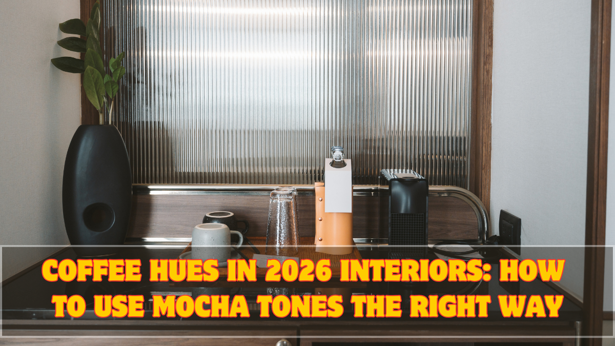
Interior design coffee hues 2026 are everywhere—but most people are using them wrong. Mocha, latte, espresso, and cocoa tones are dominating homes because they feel grounding, warm, and emotionally calming. But without the right balance, these colors can quickly make rooms feel heavy, dated, or dull.
The goal in 2026 is not “dark interiors.” It’s depth without darkness.

Why Coffee Hues Are Trending in 2026
This shift is emotional, not decorative.
Key reasons behind the rise of coffee hues:
• Burnout from stark white interiors
• Preference for cozy, sanctuary-like homes
• Growing influence of wellness-focused design
• Desire for timeless, non-trendy colors
Coffee tones feel stable—and people are craving stability.
What Counts as Coffee Hues (Beyond Brown)
Coffee hues are broader than people think.
They include:
• Mocha tones
• Latte beige
• Warm taupe
• Cocoa brown
• Soft espresso
The undertone matters more than how dark the color looks.
Why Mocha Tones Feel Luxurious, Not Heavy
Mocha tones sit perfectly between light and dark.
They work because:
• They absorb light gently
• They soften sharp edges
• They add depth without drama
Mocha is rich, not loud.
Where Coffee Hues Work Best in Homes
Placement decides success.
Best areas for coffee hues:
• Living room accent walls
• Bedrooms
• Reading corners
• Dining spaces
They perform best where relaxation matters.
How to Avoid Making Rooms Look Dark
This is the biggest fear—and mistake.
Avoid darkness by:
• Using coffee hues on one surface only
• Pairing with warm neutrals
• Keeping ceilings lighter
• Balancing with reflective textures
Darkness comes from imbalance, not color alone.
The Role of Warm Neutrals in Balancing Coffee Tones
Warm neutrals are essential partners.
Good pairings include:
• Off-white
• Soft cream
• Warm beige
• Light sand tones
They prevent coffee hues from overpowering the space.
Lighting: The Make-or-Break Factor
Lighting determines whether coffee hues glow or die.
Key lighting rules:
• Warm lighting only (never cool white)
• Layered lighting (ambient + task)
• Avoid single harsh ceiling lights
Bad lighting ruins even perfect color choices.
Sanctuary Rooms: Where Coffee Hues Shine Most
Sanctuary rooms are calm-first spaces.
Coffee hues work especially well in:
• Bedrooms
• Meditation rooms
• Home libraries
• Lounge corners
They lower visual stress and promote rest.
Textures That Elevate Coffee Hues
Flat finishes can look dull.
Use textures like:
• Wood grains
• Linen fabrics
• Matte ceramics
• Soft rugs
Texture adds life without adding color noise.
Furniture Choices That Complement Coffee Palettes
Furniture should support—not compete.
Best options:
• Light wood finishes
• Upholstered pieces in neutral tones
• Rounded shapes
Sharp, glossy furniture clashes with coffee hues.
Coffee Hues in Small Indian Apartments
Yes, they work—even in compact homes.
Tips:
• Use lighter coffee shades
• Limit to one wall or zone
• Add mirrors strategically
Depth makes small rooms feel intentional, not cramped.
Common Mistakes With Coffee-Colored Interiors
Avoid these errors:
• Painting entire rooms dark
• Mixing cool whites with warm browns
• Ignoring lighting temperature
These mistakes flatten the look.
How to Introduce Coffee Hues Without Renovation
You don’t need paint immediately.
Easy upgrades:
• Coffee-toned curtains
• Cushions or throws
• Rugs
• Wall art with warm undertones
Test before committing.
Why Coffee Hues Feel Timeless
They don’t chase trends.
Coffee tones:
• Age gracefully
• Hide wear well
• Match evolving furniture
They stay relevant longer than bold colors.
Why This Trend Extends Beyond 2026
This isn’t a short-lived phase.
It aligns with:
• Wellness-driven interiors
• Sustainable design
• Long-term comfort
Calm colors don’t expire quickly.
Conclusion
Interior design coffee hues 2026 are about warmth, depth, and emotional comfort. When used with the right mocha tones, balanced warm neutrals, and thoughtful lighting, these colors create homes that feel rich—not dark. The secret isn’t going bold. It’s going balanced.
Coffee hues don’t shout luxury. They settle into it.
FAQs
Are coffee hues suitable for small homes?
Yes, when used in lighter shades and balanced with warm neutrals.
Do coffee-colored walls make rooms look smaller?
Only if lighting and contrast are poor. Balanced use adds depth instead.
What lighting works best with coffee hues?
Warm, layered lighting works best—never cool white lights.
Can coffee hues be used in modern interiors?
Absolutely. They pair beautifully with clean lines and minimal furniture.
Will coffee hues go out of trend after 2026?
Unlikely. They are timeless, wellness-driven colors.