Color trends often fail because people try to copy them literally instead of translating them into their own homes. Pinterest’s color palette for 2026 is not about painting everything in dramatic shades or following rigid design rules. It reflects emotional intent. People are searching for colors that feel grounding, expressive, and calming at the same time, especially in homes that now serve multiple purposes.
For Indian homes, this palette is particularly relevant because it balances richness with restraint. The shades are deep but not loud, bold but not chaotic. This guide explains how to use the Pinterest Color Palette 2026 practically, room by room, without turning your home into a trend experiment that feels tiring after a few weeks.
Why Pinterest Color Trends Matter More Than Paint Catalogs
Pinterest color trends are driven by how people want to feel, not just what looks fashionable. Users save color ideas while planning real spaces, which makes these palettes intent-based rather than aspirational.
In 2026, search behavior shows a strong preference for colors that create emotional zones. Calm bedrooms, expressive living rooms, and warm workspaces are replacing uniform color schemes across homes.
This shift makes color selection more strategic than decorative.
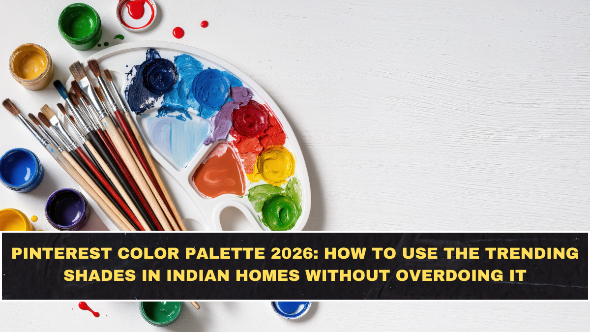
The Core Pinterest Color Palette for 2026
The dominant shades for 2026 include cool blues, jade greens, muted plums, warm clay tones, and softened neutrals. These colors feel saturated but controlled.
What makes this palette different is its softness. Even darker shades have muted undertones that prevent harsh contrast.
This allows bold colors to exist comfortably in daily living spaces.
How to Use Deep Blues Without Darkening a Room
Deep blue is one of the most saved shades, but it intimidates many homeowners. The key is placement.
Using deep blue on one wall, cabinetry, or soft furnishings grounds the room without absorbing too much light. Pairing it with warm neutrals keeps the space balanced.
In Indian homes, blue works especially well in living rooms and study areas.
Jade and Green Tones for Calm, Lived-In Spaces
Jade and green shades reflect a desire for nature-inspired interiors. These colors feel restorative rather than decorative.
They work best when repeated subtly across elements like curtains, cushions, or accent furniture. Overusing green can make a space feel themed instead of natural.
Green pairs well with wood, brass, and natural fabrics common in Indian interiors.
Plum and Berry Tones as Accent Colors
Muted plum and berry shades are trending as emotional accent colors. They add depth without shouting for attention.
These tones work best in limited doses, such as upholstery, artwork, or bedding. They bring warmth and sophistication without overpowering the room.
In Indian bedrooms and dining areas, these shades feel rich and comforting.
Warm Clay and Earth Tones for Balance
Earthy clay, terracotta, and sand tones are central to the 2026 palette. They act as visual stabilizers.
These colors are ideal for floors, walls, or large furniture pieces because they age well and hide wear. They also blend seamlessly with traditional Indian materials.
Earth tones prevent bold palettes from feeling overwhelming.
Room-Wise Color Application Strategy
Living rooms benefit from one bold anchor color balanced with neutral seating. Bedrooms work best with softer variations of trending shades.
Kitchens and workspaces should use color in controlled accents to maintain energy without distraction. Bathrooms can handle slightly higher contrast because of smaller surface areas.
Applying color strategically reduces visual fatigue.
The 60-30-10 Rule Still Applies in 2026
Despite evolving palettes, the classic balance rule remains relevant. Sixty percent should be a base color, thirty percent a secondary tone, and ten percent an accent.
Pinterest trends reinforce this structure rather than replacing it. Without proportion, even beautiful colors feel chaotic.
This rule simplifies decision-making for non-designers.
Mistakes People Make With Trending Colors
The most common mistake is using trending colors everywhere at once. Trends should be layered gradually.
Another mistake is ignoring lighting. Colors look different under warm and cool light, which can dramatically change mood.
Testing samples in real lighting is essential.
Budget-Friendly Ways to Use the Palette
You do not need repainting to follow color trends. Soft furnishings, art, rugs, and lampshades introduce color with low commitment.
This approach allows experimentation without long-term regret.
Small changes often create the biggest visual impact.
Conclusion: Pinterest Colors 2026 Are About Emotional Balance
The Pinterest Color Palette 2026 is not about making homes louder. It is about making them feel emotionally supportive.
When used thoughtfully, these colors create spaces that feel intentional, lived-in, and personal. The goal is harmony, not trend replication.
Color works best when it supports how you live, not how your home photographs.
FAQs
Are Pinterest color trends suitable for Indian homes?
Yes, many shades align naturally with Indian materials and lighting conditions.
Do I need to repaint to follow 2026 color trends?
No, soft furnishings and accents are often enough.
Which rooms handle bold colors best?
Living rooms and bedrooms adapt well when colors are applied selectively.
How many trending colors should I use in one room?
Usually one main shade with one supporting tone works best.
Do these colors work in small spaces?
Yes, when used in limited areas with good lighting.
Will these colors feel outdated quickly?
Muted, balanced shades tend to age better than extreme trends.